
HUB (Hands-on
Understanding of Bioinformatics) Workshop
Bulk RNA-seq Data
Analysis
by
Bioinformatics Hub
[Session 4] From Counts to Biological Differences:
Normalization, Modelling, and Interpretation.
1 Introduction
1.1 Study and analysis overview
Irmady K, Hale CR, Qadri R, et al. Blood transcriptomic signatures associated with molecular changes in the brain and clinical outcomes in Parkinson’s disease. Nat Commun. 2023;14:3956.
- The study analyzed post-mortem brain tissue from 75
donors—40 neurologically healthy controls and
35 individuals with Parkinson’s disease (PD). RNA-seq
was performed on two striatal regions from each donor:
the caudate (CAU) and the putamen
(PUT). This resulted in a total of 150 RNA-seq
samples, with each donor contributing one sample from each
brain region.
- The authors do not publicly release the raw sequencing data (FASTQ files).
- Instead, they provide a preprocessed gene count matrix generated with Salmon.
- Figure 1 of the paper contains seven panels. In
this session, we reproduce five of them.
- We do not reproduce:
- Figure 1a, which is a BioRender schematic illustrating the study design and does not involve data analysis.
- Figure 1g, the blood-based classifier heatmap, which is covered in Session 5.
- We do not reproduce:
- It is helpful to interpret Figures 1b and
1c together, as they address complementary questions.
- Figure 1b is an unsupervised analysis. We allow the data to reveal its intrinsic structure without providing any information about sample labels, asking whether samples naturally cluster by brain region or disease status.
- Figure 1c is a supervised analysis. Here, the disease labels are explicitly incorporated into the statistical model to identify genes that are differentially expressed between PD and control samples.
| Panel | Analysis | Biological question |
|---|---|---|
| Figure 1b | PCA | Do samples separate by brain region and disease status without using prior sample labels? |
| Figure 1c | Volcano plot | Which genes are differentially expressed between PD and control, and what is the magnitude of those changes? |
| Figure 1d | Bubble plot | Which biological processes are altered, rather than which individual genes? |
| Figure 1e | Box plot | Which biological process is altered in both brain regions? |
| Figure 1f | Box plot | Which biological process is altered in only one brain region? |
1.2 Published workflow and analytical deviations
- We closely follow the workflow described in the paper’s
Methods, with only one methodological
deviation and one minor implementation
difference.
- Quantification. Reads were quantified with
Salmon against the hg38 UCSC
knownGeneannotation. This step was covered in Session 3 using a smaller dataset. We do not repeat it here because reproducing the original analysis would require processing approximately 150 RNA-seq samples against the full reference transcriptome. Instead, we begin with the gene count matrix deposited by the authors in GEO. - Gene filtering. As described in the paper, genes
were filtered using
edgeR::filterByExpr()from the edgeR package with the default settings. We reproduce this step exactly.
- We added explicit package namespaces in the code chunks so it is clear which package each function comes from.
- Sample grouping. Samples were grouped according to
brain region and disease status,
yielding four experimental groups:
CTRL_CAU,CTRL_PUT,PD_CAU, andPD_PUT. We reproduce this grouping exactly. - Linear model. The authors fitted the design matrix
~ 0 + group + death_age. This is the only methodological deviation from the published workflow. In the publicly released metadata, age at death has been redacted for all control donors: all 80 control samples contain the literal value"CTRL"rather than a numerical age. Because this covariate cannot be reconstructed, we omit it from the design and instead fit~ 0 + group. In Step 5, we examine the impact of this modification. - Normalization. Differential expression analysis was
performed using
limma::voomWithQualityWeights()from limma, which estimates sample-specific quality weights to down-weight lower-quality samples. We reproduce this step exactly. This procedure is particularly important because RNA integrity numbers (RINs) in this cohort range from 2.3 to 8.9, indicating substantial variation in RNA quality. - Differential expression testing. Differential expression was assessed using limma’s moderated t-tests, with multiple testing correction performed using the Benjamini–Hochberg false discovery rate procedure. We reproduce this analysis exactly.
- Gene set analysis. Gene Set Variation
Analysis (GSVA) was performed using the MSigDB C5 Gene
Ontology collection, followed by the same
limma contrasts applied to the GSVA enrichment scores.
We use the identical gene set file referenced in the authors’ code,
c5.all.v7.1.symbols.gmt, which is included with this tutorial. - Principal component analysis (PCA).
Voom-transformed expression values were adjusted using
limma::removeBatchEffect()to remove the effects of sex and RNA quality (RIN), and PCA was performed on the 500 most variable genes. We reproduce this workflow exactly. The only implementation difference is that, instead of usinglimma::correlatePCs(), we callkruskal.test()directly. This yields the same statistical test without relying on the wrapper.
- Quantification. Reads were quantified with
Salmon against the hg38 UCSC
- Summary
- One methodological deviation: We omit
death_agebecause it is unavailable in the publicly released metadata. - One implementation difference: We use
kruskal.test()directly instead oflimma::correlatePCs(). - Everything else follows the published analysis as closely as possible.
- One methodological deviation: We omit
1.3 Environment
- This session is designed to run in native R, so the workflow can be readily applied to your own RNA-seq datasets.
- Required R packages: edgeR, limma, statmod, GSVA, GSEABase.
1.4 Step 0 — Set up the R environment
- This session can be run either on your local R
installation or using the provided Docker
image.
- If you choose to run the analysis on your own machine, install the required R packages before the workshop.
- If you use the Docker image, all required packages are already installed and no additional setup is necessary.
# Note: Whether you are using the Docker image or your local installation, launch R or RStudio.
R- Now point R at the data folder:
# Note: From this point onward, all code chunks are written in R.
#       Throughout this guide, file paths are given relative to the Docker image for consistency.
setwd("/workshop/data/analysis")
list.files()
## [1] "c5.all.v7.1.symbols.gmt" "GSE205450_counts.table.txt.gz"
## [3] "install_R_packages.R" "precomputed"
## [5] "sample_sheet.tsv" "source.txt"- The following code installs what is needed, loads
every package to prove it really works, and confirms the data files are
present; it is safe to run twice.
- Installing Bioconductor packages during the session can take considerable time and may cause you to fall behind.
source("/workshop/data/analysis/install_R_packages.R")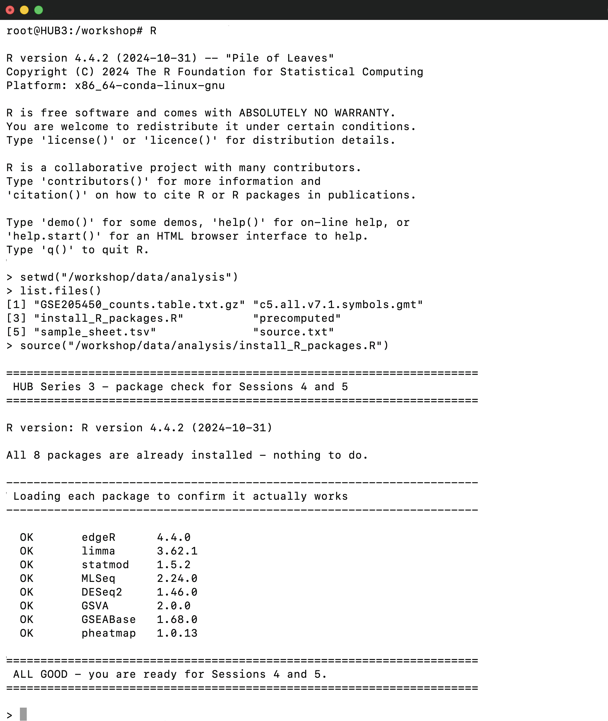
2 Step 1 — Load and validate the input data
- Produces:
25186 151— 25,186 genes, and 151 columns = 150 samples plus one column of gene names. check.names = FALSEmatters. The sample names start with digits (2589_CTRL_CAU), and R’s default would silently rewrite them toX2589_CTRL_CAU, which then fails to match the sample sheet.
counts <- read.delim("GSE205450_counts.table.txt.gz", check.names = FALSE)
dim(counts)
## [1] 25186 1512.1 Clean and format the count matrix
68rows have no gene symbol. In the file on disk these are the literal two-character text"NA"— butread.delimconverts that text into R’s missing value. This is a real trap, because the obvious filter
sum(is.na(counts$Gene_symbol))## [1] 6825118 150. Now it is a clean numeric matrix: genes in rows, samples in columns, gene symbols as row names.- The authors hit this too — their own released
Classifier.Rmdfilters withis.na()for exactly this reason.
counts <- counts[!is.na(counts$Gene_symbol), ]
counts <- counts[!duplicated(counts$Gene_symbol), ]
rownames(counts) <- counts$Gene_symbol
counts <- as.matrix(counts[, -1])
dim(counts)
## [1] 25118 1502.2 Load and align the sample metadata
- A gene count matrix contains only gene expression counts; it does not record sample-level information such as disease status (PD vs. control) or brain region (CAU vs. PUT).
- Those annotations are provided in a separate sample metadata file.
150 14, then the first few rows —Sample,Patient,Diagnosis,Region,Gender,RIN,PMI.
meta <- read.delim("sample_sheet.tsv", check.names = FALSE)
dim(meta)
head(meta[, 1:7])
## [1] 150 14## Sample Patient Diagnosis Region Gender RIN PMI
## 1 2589_CTRL_CAU CTRL_23 CTRL CAU M 6.2 15.0
## 2 2590_CTRL_PUT CTRL_23 CTRL PUT M 6.8 15.0
## 3 2653_PD_CAU PD_22 PD CAU M 6.5 9.0
## 4 2654_PD_PUT PD_22 PD PUT M 7.4 9.0
## 5 2667_CTRL_CAU CTRL_24 CTRL CAU M 2.7 24.1
## 6 2668_CTRL_PUT CTRL_24 CTRL PUT M 2.6 24.1- Ensure that the sample IDs in the count matrix columns and the metadata rows are in the same order.
identical(colnames(counts), meta$Sample)## [1] TRUE2.3 Verify the experimental design
- Verify the study design by summarizing the number of samples in each experimental group.
table(meta$Diagnosis, meta$Region)##
## CAU PUT
## CTRL 40 40
## PD 35 353 Step 2 — Define the design, filter genes, and normalize libraries
- Build the four-level grouping variable the authors used:
3.1 Define the experimental groups and design matrix
meta$group <- factor(paste(meta$Diagnosis, meta$Region, sep = "_"),
                     levels = c("CTRL_CAU", "CTRL_PUT", "PD_CAU", "PD_PUT"))
table(meta$group)
##
## CTRL_CAU CTRL_PUT PD_CAU PD_PUT
## 40 40 35 35- The
~ 0 +means “no intercept”: give me one column per group rather than one baseline group plus differences from it. That makes the next step readable — we can write the comparison we want as plain subtraction. This is also where the authors had+ death ageand we do not.
design <- model.matrix(~ 0 + group, data = meta)
colnames(design) <- levels(meta$group)
dim(design)
## [1] 150 43.2 Filter low-expression genes
- After filtering, 18,938 of the original 25,118 genes are retained, while approximately 6,200 lowly expressed genes are removed. These genes have insufficient read counts to support reliable statistical inference. Retaining them would reduce statistical power because each additional hypothesis contributes to the multiple-testing burden, making it more difficult to detect truly differentially expressed genes.
- Importantly,
edgeR::filterByExpr()is group-aware. A gene expressed only in the 35 PD caudate samples is retained because it is sufficiently expressed within at least one experimental group. In contrast, a simple filter based on the overall average count (e.g., average count > 10) would likely discard such a gene, even though it may represent a biologically meaningful, group-specific signal.
dge  <- edgeR::DGEList(counts = counts)
keep <- edgeR::filterByExpr(dge, group = meta$group)
sum(keep)
## [1] 189383.3 Normalize library composition
- TMM (trimmed mean of M-values) corrects composition, which is subtler than sequencing depth. If a handful of genes are enormously expressed in one sample, they eat up the reads, and every other gene in that sample looks lower than it really is — purely as an accounting artifact. TMM estimates one scaling factor per sample to undo that. A factor of 0.25 is a sample that needed a substantial correction.
dge <- dge[keep, , keep.lib.sizes = FALSE]
dge <- edgeR::calcNormFactors(dge, method = "TMM")
range(dge$samples$norm.factors)
## [1] 0.2504046 1.26555254 Step 3 — Model the mean–variance relationship and sample quality
- This is the key normalization step in the paper and the most
computationally intensive step in this tutorial. It addresses
two fundamental challenges in RNA-seq data analysis:
- Mean–variance relationship. RNA-seq count data are
heteroscedastic: genes with low expression exhibit much
higher relative variability than highly expressed genes, violating the
assumptions of ordinary linear models.
limma::voom()estimates the empirical mean–variance relationship in your dataset and transforms the counts into log2 counts per million (log-CPM), while assigning a precision weight to every observation. - Sample quality.
limma::voomWithQualityWeights()extends this approach by estimating an additional weight for each sample. This is particularly important for the present dataset, where RNA integrity numbers (RINs) range from 2.3 to 8.9, reflecting substantial variation in RNA quality. Rather than excluding lower-quality samples, the method retains them while appropriately reducing their influence on downstream analyses.
- Mean–variance relationship. RNA-seq count data are
heteroscedastic: genes with low expression exhibit much
higher relative variability than highly expressed genes, violating the
assumptions of ordinary linear models.
4.1 Apply voom with quality weights
vv <- limma::voomWithQualityWeights(dge, design = design,
                             plot = TRUE, normalize.method = "none")
4.2 Inspect the sample quality weights
- The estimated sample weights range from 0.25 to 3.38, meaning that the highest-quality sample contributes approximately 13 times more weight than the lowest-quality sample. These weights are inferred directly from the expression data—not from the recorded RIN values—although they generally correlate well with RNA quality, providing reassurance that the weighting procedure is capturing meaningful technical variation.
range(vv$targets$sample.weights)## [1] 0.2458534 3.3757388- The normalized expression matrix contains 18,938 genes measured across 150 samples, matching the dimensions expected after filtering.
dim(vv$E)## [1] 18938 150- If this step is too slow or fails to complete**, you can use the
precomputed object included with this tutorial. Simply load it and
continue with the remaining analysis. This shortcut is perfectly
acceptable—the focus of this session is on interpreting and analyzing
the normalized data, not on waiting for
limma::voomWithQualityWeights()to finish.
# Note: If voomWithQualityWeights() did not complete successfully, load the precomputed object instead.
vv <- readRDS("precomputed/voom.rds")
dim(vv$E)
5 Step 4 — Figure 1b - explore sample structure with PCA
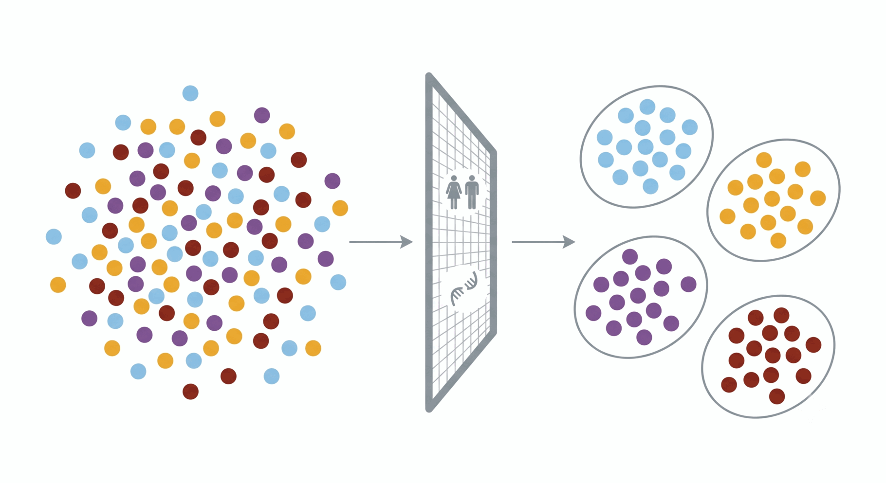
- The goal of this analysis is to answer a simple question: if we remove all sample labels and give the computer only the gene expression data, can it recover the underlying study design on its own? PCA is an unsupervised method, so it has no knowledge of brain region or disease status.
5.1 Remove unwanted variation while preserving disease effects
- Before performing PCA, the authors removed variation associated with
sex and RNA quality (RIN). This step
is essential because these factors contribute substantial technical and
biological variation that can obscure the effects of interest.
- The cohort contains 110 male and 40
female donors. Sex-linked genes (e.g.,
XISTand Y-chromosome genes) are among the most variable genes in nearly every human transcriptomic dataset. If left uncorrected, they can dominate the leading principal components. - The
designargument specifies the variation that should be preserved. Here,limma::removeBatchEffect()removes the effects of sex and RIN while retaining the differences between the four experimental groups.
- The cohort contains 110 male and 40
female donors. Sex-linked genes (e.g.,
expr <- limma::removeBatchEffect(vv$E,
                          batch      = factor(meta$Gender),
                          covariates = meta$RIN,
                          design     = design)
5.2 Select the 500 most variable genes and calculate the principal components
- As in the paper, PCA is performed using the 500 most
variable genes. The expression matrix is transposed with
t()becauseprcomp()expects samples in rows and genes in columns. - In this dataset, PC1 explains 17.5% of the total variance and PC2 explains 9.3%.
vg  <- order(apply(expr, 1, var), decreasing = TRUE)[1:500]
pca <- prcomp(t(expr[vg, ]), scale. = TRUE)
pv  <- round(100 * pca$sdev^2 / sum(pca$sdev^2), 1)
pv[1:2]
## [1] 17.5 9.35.3 Visualize separation by region and diagnosis
- We use the same color palette as the original paper throughout Sessions 4 and 5 so that each color consistently represents the same experimental group.
- The paper displays an 80% confidence ellipse around each group. Base R does not provide this functionality directly, so the helper function below constructs ellipses from the covariance matrix of the first two principal components.
- The expected pattern closely matches the published figure:
- PC1 separates the two brain regions, with putamen (amber and dark red) on one side and caudate (light blue and purple) on the other.
- PC2 separates control and PD samples, with controls (light blue and amber) below PD samples (purple and dark red).
- The ellipses are intended only as a visual aid. They do not provide evidence of statistical significance; that is assessed in the next section.
PAL4 <- c(
  CTRL_CAU = "#7FBEE7",  # Control Caudate - light blue
  CTRL_PUT = "#ECAC1F",  # Control Putamen - amber
  PD_CAU   = "#7F509F",  # PD Caudate - purple
  PD_PUT   = "#8A271B"   # PD Putamen - dark red
)

ell <- function(x, y, level = 0.8, n = 200) {
  m <- cbind(x, y)
  ctr <- colMeans(m)
  e <- eigen(cov(m))

  r <- sqrt(qchisq(level, df = 2))
  th <- seq(0, 2 * pi, length.out = n)

  t(ctr + e$vectors %*% diag(sqrt(pmax(e$values, 0)) * r) %*% rbind(cos(th), sin(th)))
}

old_par <- par(no.readonly = TRUE); on.exit(par(old_par), add = TRUE)

par(mar = c(5.1, 4.1, 4.1, 9.5), xpd = NA)
plot(pca$x[, 1], pca$x[, 2], type = "n", xlab = paste0("PC1 (", pv[1], " %)"), ylab = paste0("PC2 (", pv[2], " %)"))

for (g in levels(meta$group)) {
  k <- meta$group == g

  polygon(
    ell(pca$x[k, 1], pca$x[k, 2]),
    border = PAL4[g],
    lwd = 1.6
  )
}

points(pca$x[, 1], pca$x[, 2], col = PAL4[as.character(meta$group)], pch = 19,  cex = 1.15)
legend(
  "topright",
  inset = c(-0.42, 0),
  legend = c("Control Caudate", "PD Caudate", "Control Putamen", "PD Putamen" ),
  col = PAL4[c("CTRL_CAU", "PD_CAU", "CTRL_PUT", "PD_PUT")],
  pch = 19, bty = "n", cex = 0.9, title = "Group", title.adj = 0
)
5.4 Test the associations with region and diagnosis
- Visual inspection is informative, but the separation should also be
tested statistically.
- The published study reports P = 2.6 × 10⁻²⁰ for the association between PC1 and brain region, and P = 2.08 × 10⁻⁸ for the association between PC2 and disease status. Obtaining the same principal components, directions, and order of magnitude provides strong evidence that we have successfully reproduced the published analysis.
- An important observation is that principal components are ordered by the amount of variance they explain, not by biological importance. In this dataset, the largest source of variation is brain region, whereas the Parkinson’s disease signal is smaller but still clearly detectable.
kruskal.test(pca$x[, 1] ~ factor(meta$Region))$p.value## [1] 2.494952e-19kruskal.test(pca$x[, 2] ~ factor(meta$Diagnosis))$p.value## [1] 3.568223e-096 Step 5 — Figure 1c: Test differential gene expression
- Figure 1b used an unsupervised analysis to identify the major sources of variation in the data. Here we switch to a supervised analysis by explicitly comparing Parkinson’s disease and control samples within each brain region.
6.1 Fit the linear model and define regional contrasts
- Three lines, three distinct jobs:
limma::lmFit()fits a linear model to each of the 18,938 genes.limma::contrasts.fit()defines the comparisons of interest (PD vs. control in the caudate and putamen). Because each comparison is made within a brain region, anatomical differences do not confound the disease effect.limma::eBayes()stabilizes the gene-wise variance estimates by borrowing information across all genes, producing more reliable statistics than thousands of independent t-tests.
fit <- limma::lmFit(vv, design)
ct  <- limma::makeContrasts(CAU = PD_CAU - CTRL_CAU,
                     PUT = PD_PUT - CTRL_PUT,
                     levels = design)
fit <- limma::eBayes(limma::contrasts.fit(fit, ct))
6.2 Classify genes by effect size and statistical significance
dim(res)returns18938 6: one row for each retained gene and six statistical columns—logFC,AveExpr,_t_,P.Value,adj.P.Val, andB. Becauselimma::topTable()sorts genes by significance, the first rows contain the strongest evidence for differential expression in the caudate.- Interpret significance using
adj.P.Val, notP.Value. Testing 18,938 genes at an uncorrected P < 0.05 would produce approximately 950 false positives by chance alone.adj.P.Valreports the Benjamini–Hochberg false discovery rate used in the paper.
res <- limma::topTable(fit, coef = "CAU", number = Inf)
dim(res)
## [1] 18938 6head(res, 3)## logFC AveExpr t P.Value adj.P.Val B
## GPCPD1 -1.428541 4.701309 -10.020171 2.018958e-18 3.823502e-14 31.28030
## TRIP10 1.371646 3.975859 9.732750 1.149311e-17 1.088283e-13 29.58397
## COL27A1 1.427383 4.454242 9.558633 3.279414e-17 2.070185e-13 28.573326.3 Visualize the caudate contrast with a volcano plot
- The published volcano plot encodes two pieces of information:
statistical significance (
adj.P.Val < 0.05) and effect size. Significant genes are coloured using three log2 fold-change thresholds (0.1, 0.5, and 1), with progressively darker shades indicating larger expression changes. - The assignments are made sequentially, so each threshold overwrites
the previous one. For example, a gene with
logFC = 1.4is first assigned the lightest red, then the intermediate red, and finally the darkest red. Genes that do not meet the significance threshold remain black, matching the published figure. - Instead of a conventional colour key, the paper reports the number of genes in each fold-change category. The legend therefore summarizes the result as well as explaining the colours.
VUP <- c("#F06364", "#CC4A4B", "#EB1B24")   # up   at 0.1 / 0.5 / 1
VDN <- c("#4080C3", "#196DB6", "#2A4EA0")   # down at 0.1 / 0.5 / 1

sig <- res$adj.P.Val < 0.05
col <- rep("black", nrow(res))
col[sig & res$logFC >  0.1] <- VUP[1]; col[sig & res$logFC < -0.1] <- VDN[1]
col[sig & res$logFC >  0.5] <- VUP[2]; col[sig & res$logFC < -0.5] <- VDN[2]
col[sig & res$logFC > 1.0] <- VUP[3]; col[sig & res$logFC < -1.0] <- VDN[3]- Compare your legend with the published figure. The paper reports
369,2036, and2978upregulated genes, and464,1568, and3078downregulated genes. Your counts should be similar, although not identical, because our analysis differs slightly from the original workflow. - Notice that the y-axis plots
-log10(P.Value), using the raw P values, whereas the point colours are determined byadj.P.Val. In other words, the points are positioned according to the raw P value but coloured according to the false discovery rate. This is the convention used in the paper and is common in volcano plots. - A volcano plot combines two complementary measures of differential
expression. The x-axis shows the magnitude of the change
(
logFC), while the y-axis reflects the strength of the statistical evidence. Both are important: a gene can have a large fold change but weak statistical support, or a very small fold change that is highly significant because of the large sample size. - The paper also presents the corresponding volcano plot for the
putamen. You already have everything needed to reproduce it: extract the
putamen results with
limma::topTable(fit, coef = "PUT", number = Inf), then repeat the same plotting steps.
n <- c(sum(sig & res$logFC >  1),
       sum(sig & res$logFC >  0.5 & res$logFC <=  1),
       sum(sig & res$logFC >  0.1 & res$logFC <=  0.5),
       sum(sig & res$logFC < -1),
       sum(sig & res$logFC < -0.5 & res$logFC >= -1),
       sum(sig & res$logFC < -0.1 & res$logFC >= -0.5))

par(mar = c(4.2, 4.2, 1, 1))
plot(res$logFC, -log10(res$P.Value),
     col = col, pch = 19, cex = 0.4,
     xlab = expression("PD/Control (log"[2]*"FC)"),
     ylab = expression("-log"[10]*"(p value)"))
abline(v = c(-1, -0.5, 0.5, 1), col = "grey70", lty = 2)
legend("topleft", legend = n, col = c(rev(VUP), rev(VDN)),
       pch = 19, bty = "n", cex = 0.85, y.intersp = 0.95)
6.4 Summarize differential expression in the caudate
- Using an adjusted P value threshold of 0.05 and an absolute log2 fold-change greater than 0.1, the analysis identifies 5,546 upregulated genes and 5,535 downregulated genes.
- The paper reports 5,383 upregulated and 5,110 downregulated genes. Despite omitting one covariate from the original model, our results are within approximately 3% and 8% of the published values, respectively.
sum(res$adj.P.Val < 0.05 & res$logFC > 0.1)## [1] 5546sum(res$adj.P.Val < 0.05 & res$logFC < -0.1)## [1] 55356.5 Summarize differential expression in the putamen
- The analysis identifies 5,895 upregulated genes and 6,205 downregulated genes. The paper reports 5,971 and 5,676 genes, respectively.
res_put <- limma::topTable(fit, coef = "PUT", number = Inf)
sum(res_put$adj.P.Val < 0.05 & res_put$logFC >  0.1)
## [1] 5895sum(res_put$adj.P.Val < 0.05 & res_put$logFC < -0.1)## [1] 62057 Step 6 — Figures 1d, 1e, and 1f: From genes to biological pathways
- Step 5 identified approximately 5,500 significant genes in the caudate. A list that large is difficult to interpret and highly redundant: genes involved in the same biological process often change together, so many entries reflect the same underlying biology.
- Gene-set analysis reduces that redundancy by shifting the question from which genes change? to which biological processes change?
7.1 Why move from genes to gene sets?
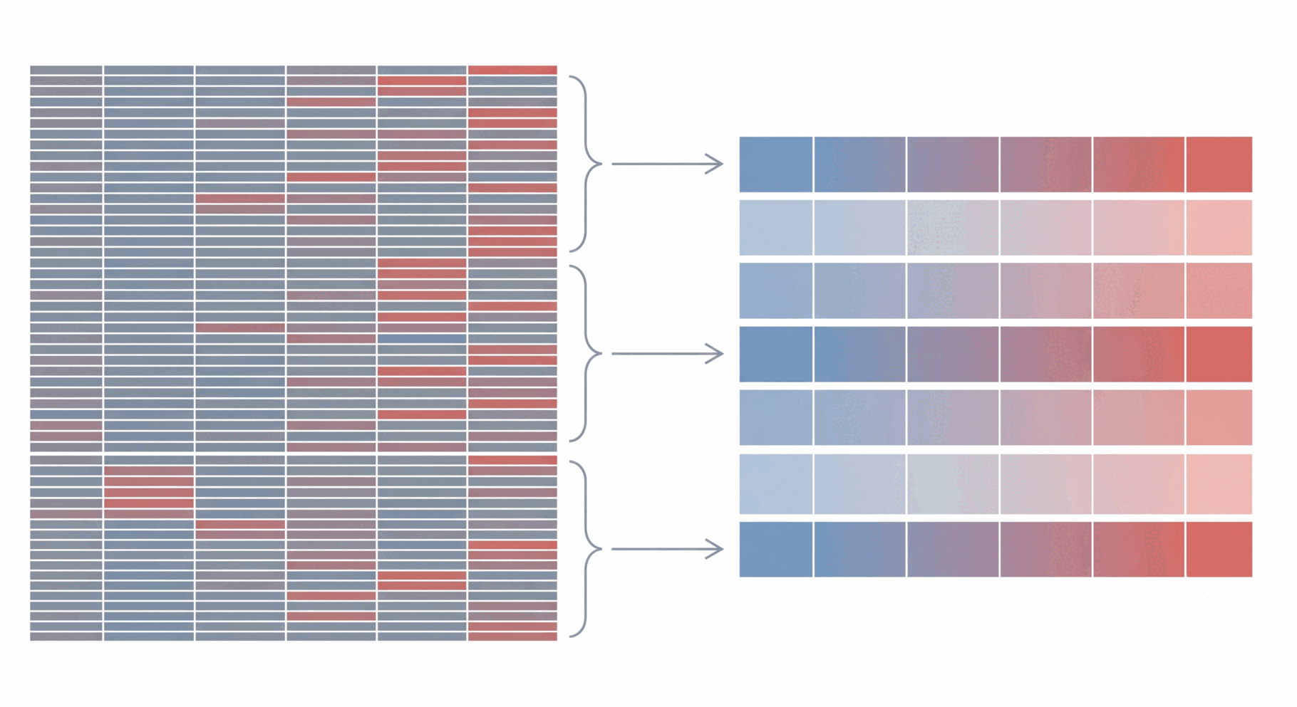
- Most enrichment methods begin with a final list of significant genes and ask which biological processes are over-represented. GSVA takes a different approach: it scores every gene set separately in every sample, producing one enrichment score per gene set per sample.
- This converts the 18,938 × 150 gene-expression matrix into a smaller
gene-set × 150 matrix. Its structure is unchanged: rows are measured
features and columns are samples. The same modelling framework therefore
still applies, so
limma::lmFit,limma::contrasts.fit, andlimma::eBayescan be reused without modification.
7.2 Calculate sample-level GSVA enrichment scores
- The GMT file contains
10192Gene Ontology gene sets. Each row gives the gene-set name followed by its member genes. - This is the same file named in the authors’ released code and is included with the workshop materials.
gs <- GSEABase::getGmt("c5.all.v7.1.symbols.gmt")
length(gs)
## [1] 10192- GSVA returns a
9689 × 150matrix. - Of the original 10,192 gene sets, 9,689 contain at least five genes that remain after Step 2 filtering and can therefore be scored.
par <- GSVA::gsvaParam(vv$E, gs, minSize = 5, maxSize = Inf, kcdf = "Gaussian")
scores <- GSVA::gsva(par, verbose = FALSE)
dim(scores)
## [1] 9689 1507.3 Test differential pathway activity
- The analysis identifies
5770significant gene sets in the caudate and6341in the putamen. - The modelling framework is unchanged:
limma::lmFit,limma::contrasts.fit, andlimma::eBayesuse the same design matrix and contrasts as before. Only the rows now represent gene sets rather than individual genes. limma::arrayWeightsreplaces voom-derived weights because GSVA scores are not counts and do not require count-specific mean–variance modelling. Sample quality can still vary, however, so noisier samples are down-weighted.
aw   <- limma::arrayWeights(scores, design = design)
fitp <- limma::lmFit(scores, design, weights = aw)
fitp <- limma::eBayes(limma::contrasts.fit(fitp, ct))

gsva_cau <- limma::topTable(fitp, coef = "CAU", number = Inf)
gsva_put <- limma::topTable(fitp, coef = "PUT", number = Inf)

sum(gsva_cau$adj.P.Val < 0.05)
## [1] 5770sum(gsva_put$adj.P.Val < 0.05)## [1] 63417.4 Figure 1d — Identify pathways altered in both regions
- A total of
5334gene sets are significant in both regions. - To summarize the shared signal, select the 12 most significant sets in the caudate and display their effects in both regions:
both <- intersect(rownames(gsva_cau)[gsva_cau$adj.P.Val < 0.05],
                  rownames(gsva_put)[gsva_put$adj.P.Val < 0.05])
length(both)
## [1] 5334- Colour represents region, while direction is encoded by position on the x-axis. Using colour for direction as well would duplicate information. Point size represents -log10(FDR), with reference values of 6 and 10 to match the paper.
- Most synaptic pathways—including synaptic vesicle transport, synaptic vesicle membrane components, SNARE complex assembly, clathrin binding, and the exocyst—are decreased in PD in both regions.
- In contrast, inflammatory pathways such as activation of NF-kappaB-inducing kinase are increased. Together, these results reproduce the paper’s central pattern: reduced synaptic function alongside increased inflammatory activity.
b   <- gsva_cau[both, ]
top <- rownames(b[order(b$adj.P.Val), ])[1:12]
dfC <- gsva_cau[top, ]
dfP <- gsva_put[top, ]

nice <- function(x) gsub("_", " ", sub("^GO_", "", x))
yy   <- seq_along(top)
REG2 <- c(Caudate = "#7F509F", Putamen = "#8A271B")

par(mar = c(4.5, 24, 1, 7.5))
plot(NA, xlim = range(c(dfC$logFC, dfP$logFC)) + c(-0.15, 0.15),
     ylim = c(0.4, length(top) + 0.6), yaxt = "n", ylab = "",
     xlab = expression("PD/Control (log"[2]*"FC)"))
axis(2, at = yy, labels = nice(top), las = 1, cex.axis = 0.70)
abline(h = yy, col = "grey93"); abline(v = 0, col = "grey55", lty = 2)
points(dfC$logFC, yy + 0.20, pch = 19,
       cex = sqrt(-log10(dfC$adj.P.Val)) * 0.80, col = REG2["Caudate"])
points(dfP$logFC, yy - 0.20, pch = 17,
       cex = sqrt(-log10(dfP$adj.P.Val)) * 0.80, col = REG2["Putamen"])
par(xpd = TRUE); xr <- par("usr")[2] + diff(par("usr")[1:2]) * 0.05
legend(xr, par("usr")[4], legend = names(REG2), col = REG2,
       pch = c(19, 17), bty = "n", cex = 0.85,
       title = "Region", title.adj = 0)
legend(xr, par("usr")[4] - diff(par("usr")[3:4]) * 0.34,
       legend = c(6, 10), pt.cex = sqrt(c(6, 10)) * 0.80, pch = 19,
       col = "grey45", bty = "n", cex = 0.85,
       title = expression("-log"[10]*"(FDR)"), title.adj = 0)
7.5 Figures 1e and 1f — Examine representative pathways
- The bubble plot summarizes pathway-level effect sizes and significance. Box plots show the sample-level distributions behind those summaries, making it easier to distinguish a consistent group shift from a result driven by a few observations.
- The paper orders the groups as caudate control, caudate PD, putamen control, and putamen PD. Because this differs from the current factor order, we set the plotting order explicitly.
- Individual samples are overlaid on the boxes so the full distribution remains visible. With 35 to 40 samples per group, quartiles alone could conceal features such as bimodality or influential observations.
- The pathways are taken directly from Figures 1e and 1f of the paper rather than selected after inspecting our results. This avoids choosing only examples that support the expected conclusion.
ord4 <- c("CTRL_CAU", "PD_CAU", "CTRL_PUT", "PD_PUT")

visualize_box <- function(term) {
  g  <- factor(as.character(meta$group), levels = ord4)
  v  <- scores[term, ]
  pC <- wilcox.test(v[meta$Region == "CAU"] ~
                    meta$Diagnosis[meta$Region == "CAU"])$p.value
  pP <- wilcox.test(v[meta$Region == "PUT"] ~
                    meta$Diagnosis[meta$Region == "PUT"])$p.value

  par(mar = c(3.2, 4.4, 4.6, 1))
  boxplot(v ~ g, outline = FALSE, xlab = "", ylab = "Enrichment score",
          xaxt = "n", col = PAL4[ord4], border = "grey30",
          ylim = range(v) + c(0, diff(range(v)) * 0.16))
  axis(1, at = 1:4, labels = c("C", "PD", "C", "PD"),
       tick = FALSE, line = -0.6)

  set.seed(1)
  points(jitter(as.integer(g), 0.9), v, pch = 19, cex = 0.55,
         col = adjustcolor(PAL4[as.character(g)], 0.75))

  yt <- par("usr")[4]
  dy <- diff(par("usr")[3:4])

  brack <- function(x1, x2, lab, p) {
    segments(x1, yt - dy * 0.055, x2, yt - dy * 0.055, col = "grey35")
    text(mean(c(x1, x2)), yt - dy * 0.028, lab, cex = 0.8)
    text(mean(c(x1, x2)), yt - dy * 0.095,
         format(p, digits = 2), cex = 0.75, col = "grey25")
  }

  brack(1, 2, "Caudate", pC)
  brack(3, 4, "Putamen", pP)
  mtext(nice(term), side = 3, line = 3.0, cex = 0.95)

  invisible(c(Caudate = pC, Putamen = pP))
}
7.5.1 Figure 1e — NOD2 signalling is increased in both regions
- The paper refers to this pathway as NOD2 signalling; the GMT file uses its full Gene Ontology name.
- The enrichment score is higher in PD than in controls in both the caudate and putamen.
- The Wilcoxon p-values are approximately
6.7e-06for the caudate and6.4e-06for the putamen. The paper reports1.0e-05and6.4e-06. - NOD2 is an intracellular pattern-recognition receptor involved in innate immune signalling. Its increase in both regions supports the inflammatory pattern identified in Figure 1d.
- We use the same two-sided Wilcoxon test as the paper. This test compares the group distributions without assuming normally distributed enrichment scores.
p_nod2 <- visualize_box("GO_NUCLEOTIDE_BINDING_OLIGOMERIZATION_DOMAIN_CONTAINING_2_SIGNALING_PATHWAY")
p_nod2## Caudate Putamen
## 6.744259e-06 6.369684e-067.5.2 Figure 1f — Mitochondrial DNA metabolism is increased only in the caudate
- Mitochondrial DNA metabolic process is increased in the caudate but remains largely unchanged in the putamen.
- The Wilcoxon p-values are approximately
0.0056for the caudate and0.58for the putamen, compared with0.0049and0.56in the paper. - Mitochondrial dysfunction is central to Parkinson’s disease biology, so the region-specific signal is biologically meaningful rather than a minor technical detail.
- The caudate and putamen are neighbouring parts of the striatum, but PD does not affect them identically. Combining both regions into a single analysis could average away this difference.
- This regional comparison is why
groupwas defined with four levels in Step 2 rather than only separating PD from control.
mtdna <- "GO_MITOCHONDRIAL_DNA_METABOLIC_PROCESS"
p_mtdna <- visualize_box(mtdna)
p_mtdna## Caudate Putamen
## 0.005571432 0.579236509gsva_cau[mtdna, c("logFC", "adj.P.Val")]## logFC adj.P.Val
## GO_MITOCHONDRIAL_DNA_METABOLIC_PROCESS 0.2216521 0.0004986815gsva_put[mtdna, c("logFC", "adj.P.Val")]## logFC adj.P.Val
## GO_MITOCHONDRIAL_DNA_METABOLIC_PROCESS -0.06918928 0.27686038 Session summary and key takeaways
- A count matrix is only interpretable when its columns are correctly
matched to the sample metadata. Because a bad join can fail silently,
confirm the alignment with
identical()before continuing. - Filter low-expression genes, normalize the libraries, and then fit the model. The order matters.
- Correcting a matrix for visualization is not the same as adjusting for covariates in a statistical model. The matrix used for Figure 1b is therefore not the matrix tested in Figure 1c.
- Effect size and statistical significance answer different questions. A volcano plot separates them across two axes for that reason.
- Approximately 5,500 significant genes do not represent 5,500 independent biological findings. Gene-set analysis reduces that redundancy and converts a long gene list into interpretable biological processes.
- The same modelling sequence—
limma::lmFit,limma::contrasts.fit, andlimma::eBayes—can test both genes and gene sets. Learn the framework rather than memorizing a single recipe.